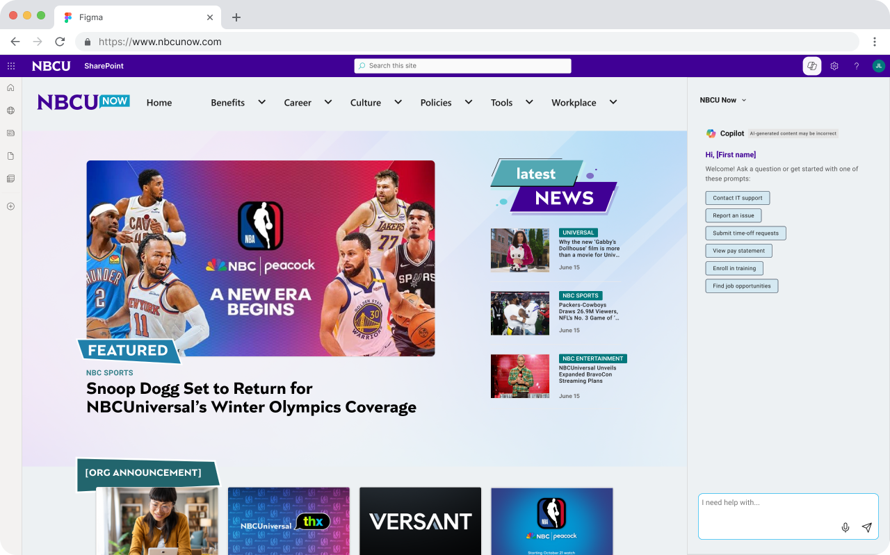
NBCUnow: Modernizing the Enterprise Intranet
Redesigning NBCU’s
Employee Experience
Scope
UX Research & Information Architecture Strategy
Tools


Problem
❗️ Leadership required a modern "AI-First" ecosystem.
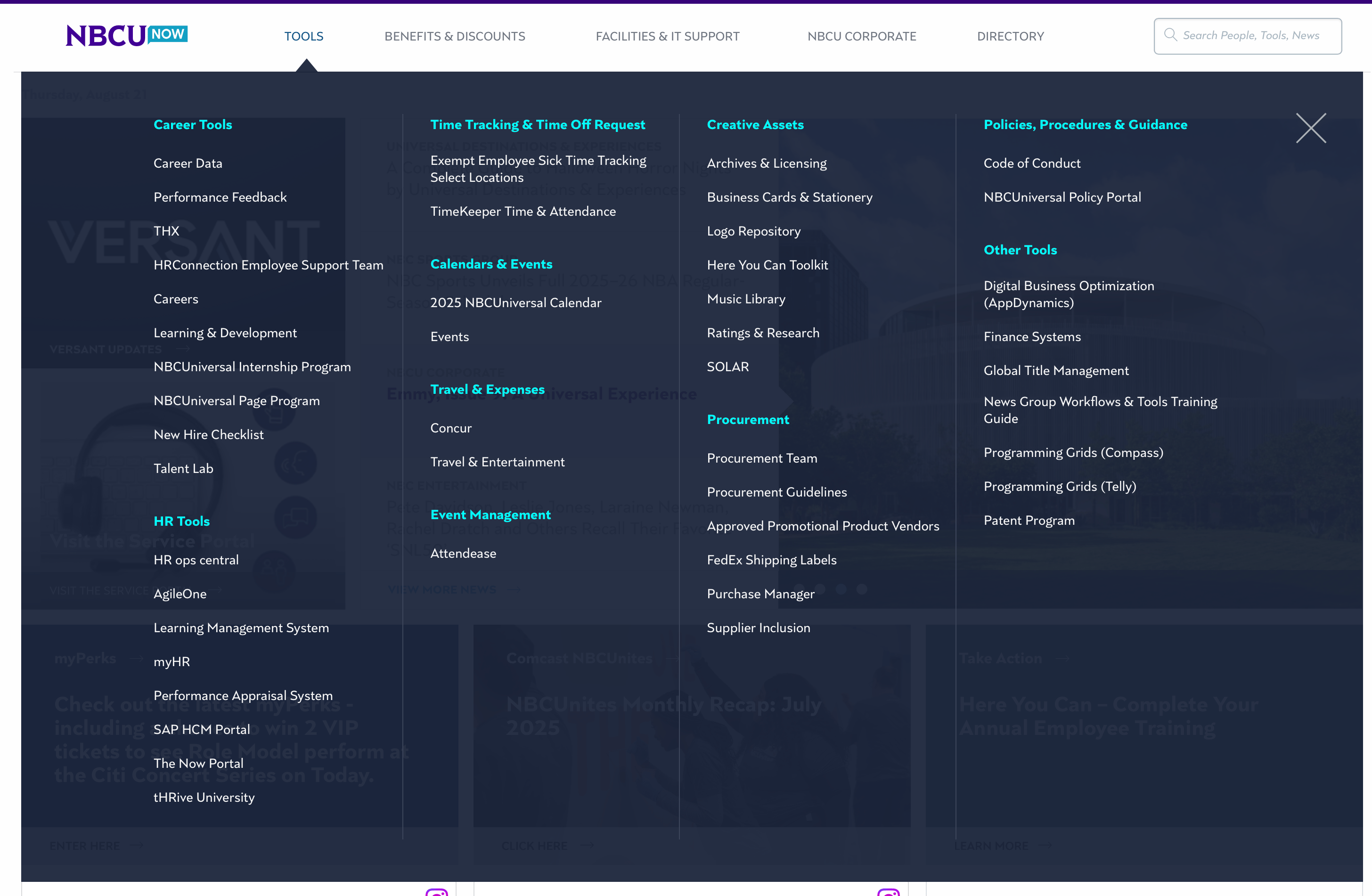
❗️ Cluttered "mega menu" hindered information findability.
❗️ UI lacked modern media company energy.
❗️ Dysfunctional search frustrated global employees.
❗️ Potential six-figure costs for help from external vendor.
Solution
✅ "2 Front Doors" strategy: AI or point-and-click navigation.
✅ Applied 2-tiered nav using validated mental models.
✅ Shifted to editorial layouts & design patterns.
✅ Cut redundant content through aggressive site audits.
✅ Proven research-led strategy eliminated need for vendor.
Competitive Research
AI Integration
To meet the executive mandate for an "AI-First" experience, I benchmarked how leading enterprise platforms and modern apps integrate artificial intelligence. I then drilled down into Microsoft applications specifically, seeing as the new intranet platform would be hosted on SharePoint.
⭐️ The right panel is an enterprise best practice for AI integration
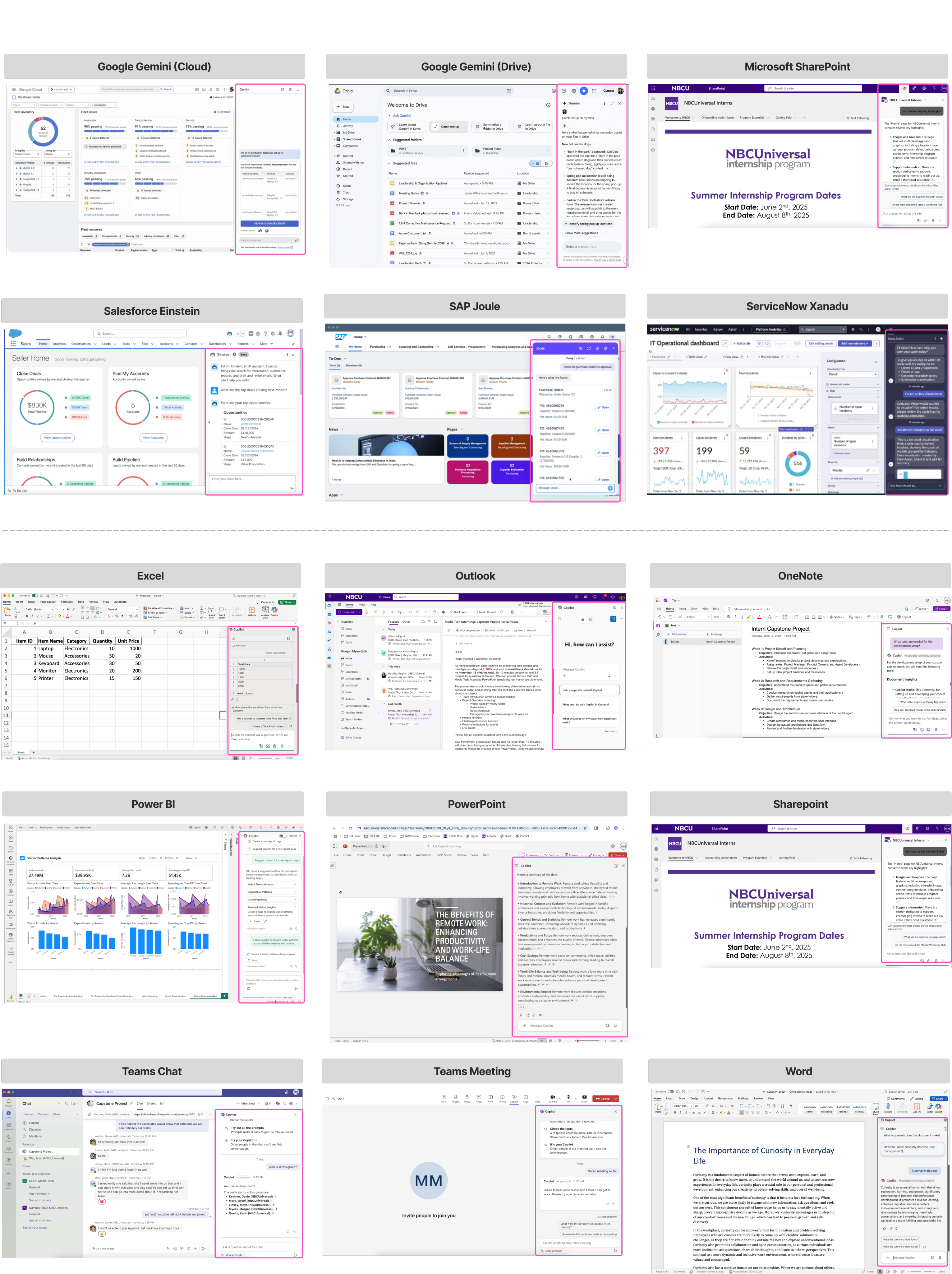
- ~85% use right-aligned panels. Outliers used popups.
- AI integrates without disrupting tasks. Windows always collapsible.
- Consistent placement reduces user cognitive load.
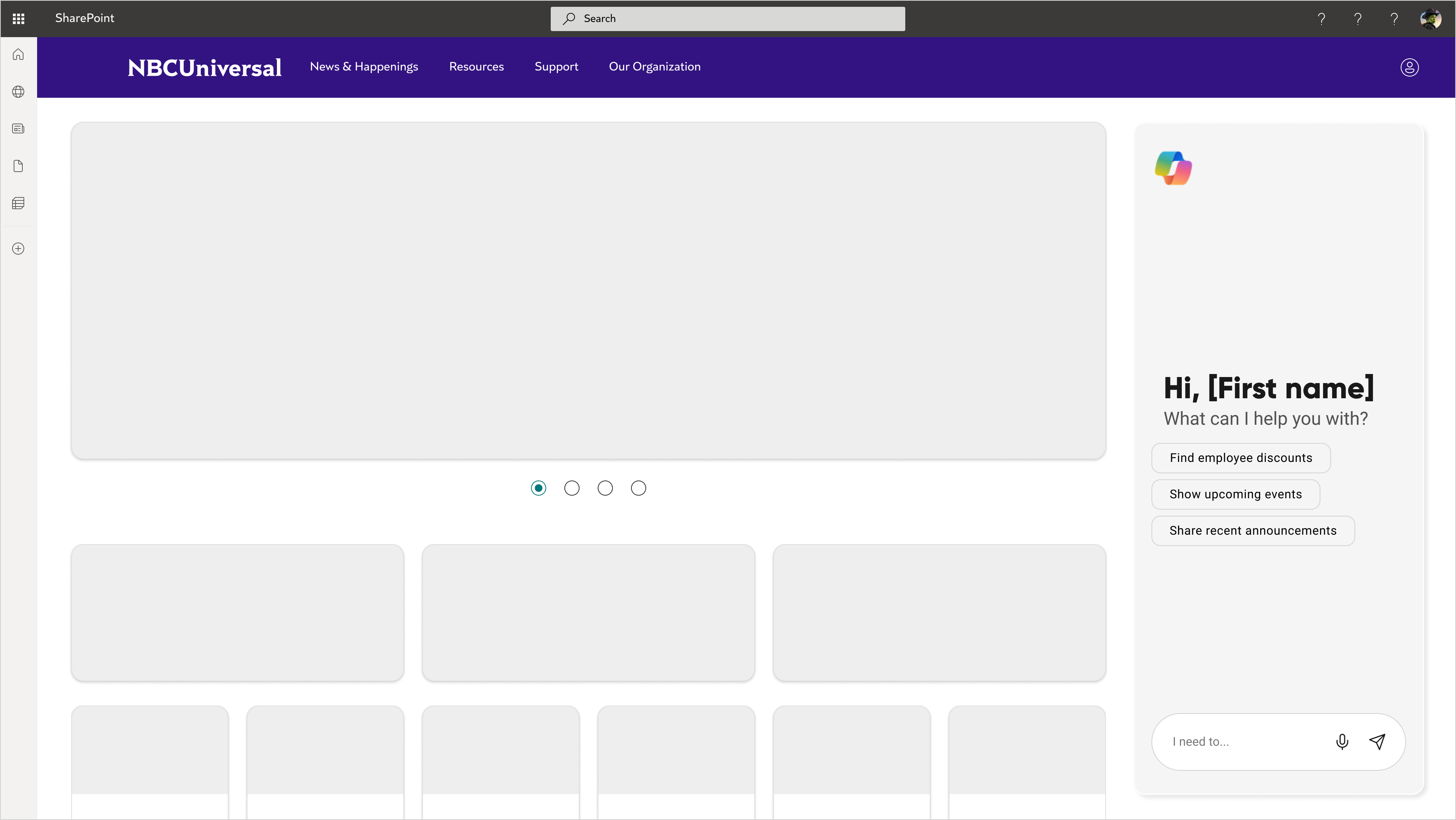
^ wireframes employed this design pattern
Editorial vs. Enterprise
After defining the AI strategy, I explored how to balance a "media company" identity with an employee’s daily functional needs.
🤔 What might a media company’s intranet look like?
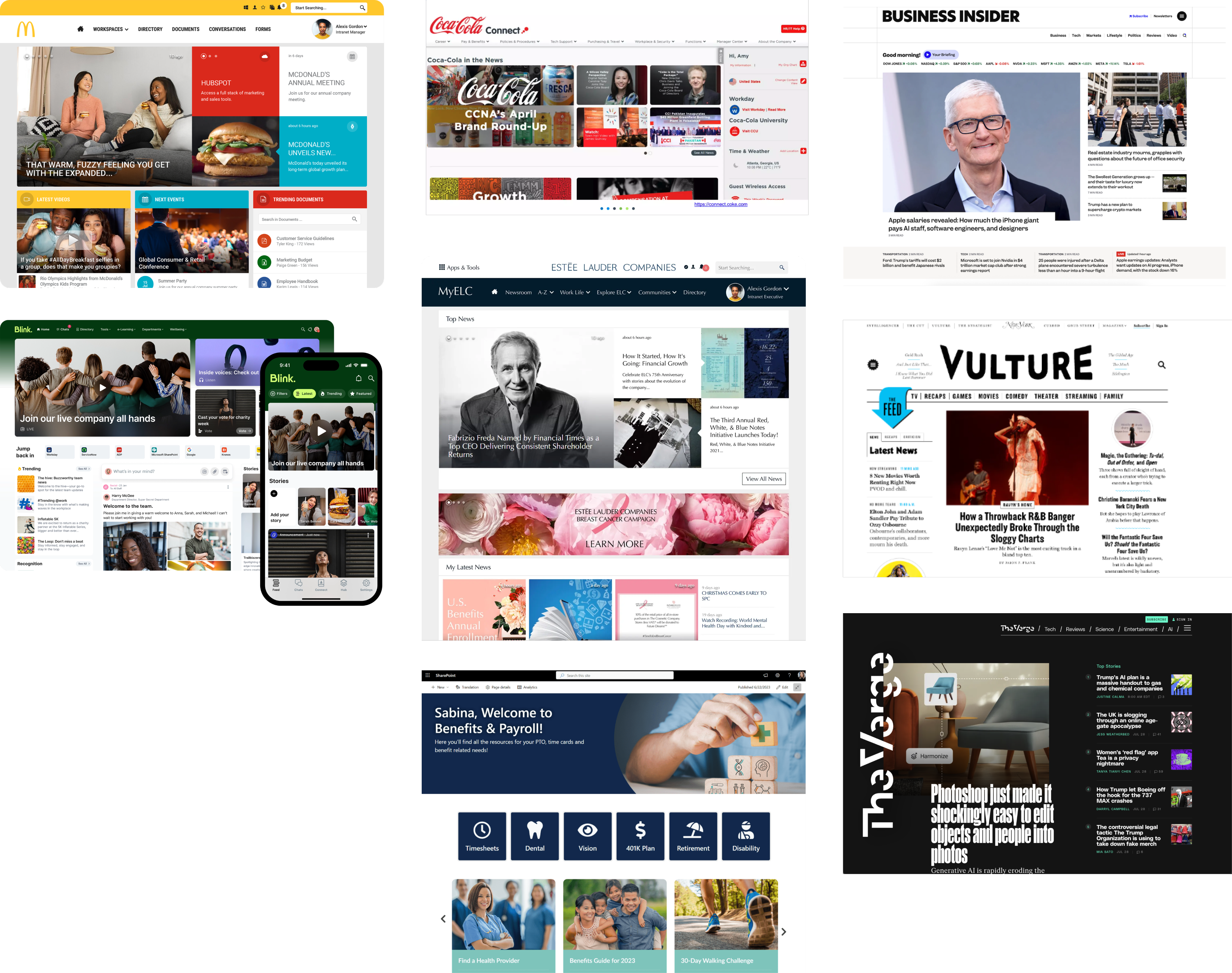
- Employee news & events are top content priorities
- Gridded & modular layout promotes scannability
- Large hero images create visual impact
🤔 What might an NBCU employee’s daily start page look like?
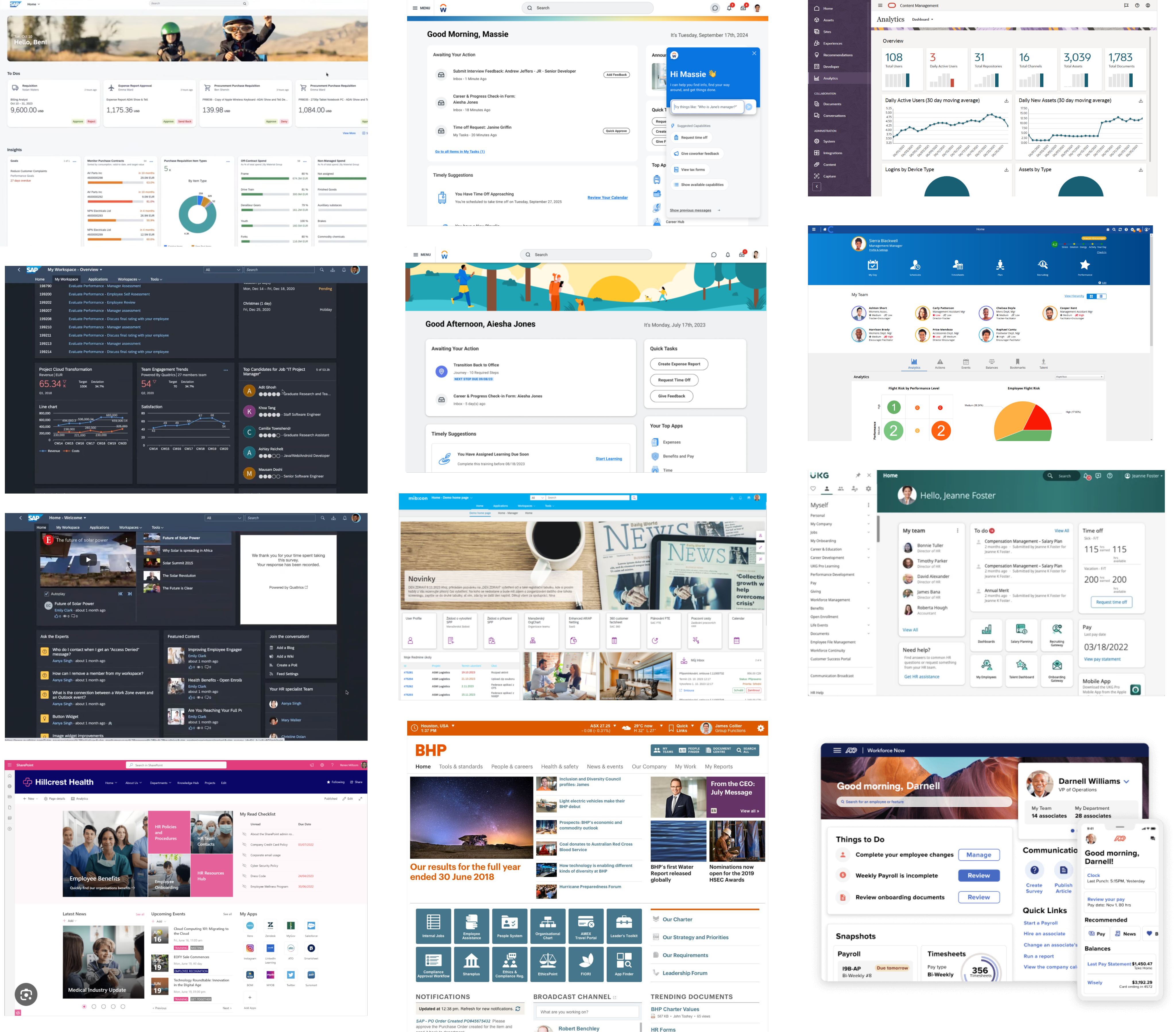
- Utility-first; quick links are often used for frequent tasks
- Modular layout supports multiple forms of content
- News, Events, AI, etc.
- Personalization is prominent, but secondary
Navigation & Information Architecture
Phase 1: Validating the Mental Model
Before building the architecture, I ran a survey to determine which navigational style—Object-Oriented, Hierarchical, or Task-Based—felt most intuitive to NBCU employees.
⭐️ Users prefer object oriented navigation
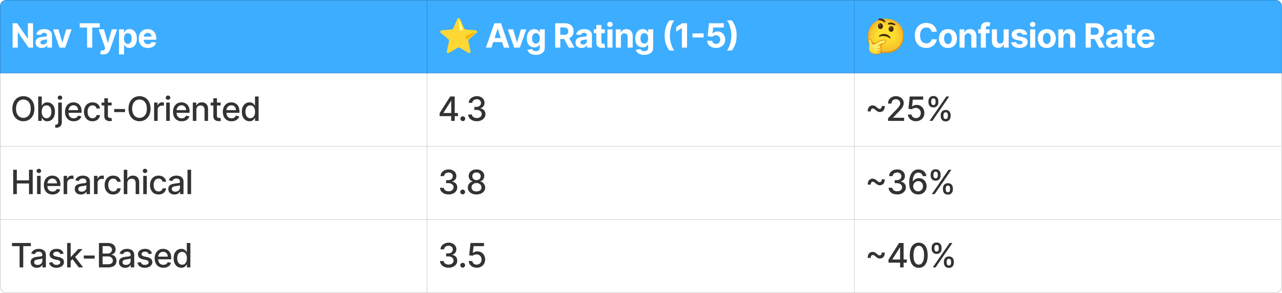
🤔 Confusion drags ratings down
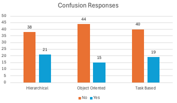
- Object-Oriented has lowest confusion rate
- About 1 in 3 respondents report confusion overall
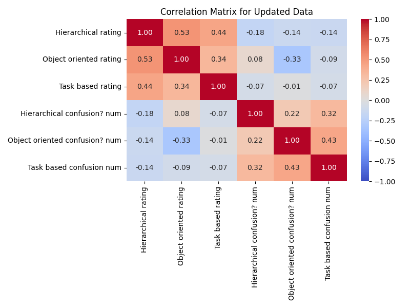
- Ratings move together
- If you liked one design, you probably liked the others too
- If one confused you, the others probably did too
Phase 2: Defining the Information Architecture
With the data favoring an object-oriented approach, I developed a Hybrid IA Strategy to balance discovery with action.
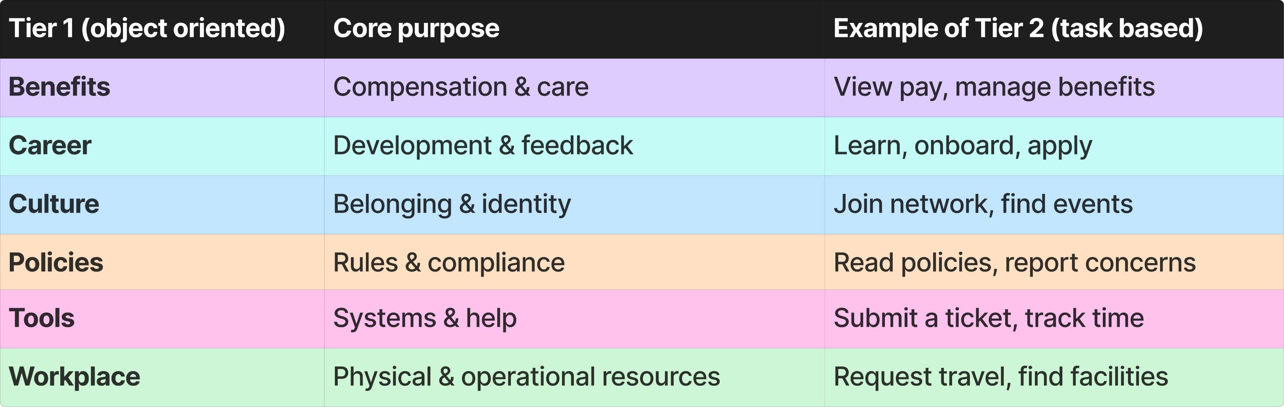
🥇 Increasing tier 1 Nav items prevents content overload
^ current state; 4 tier 1 items (+ directory)
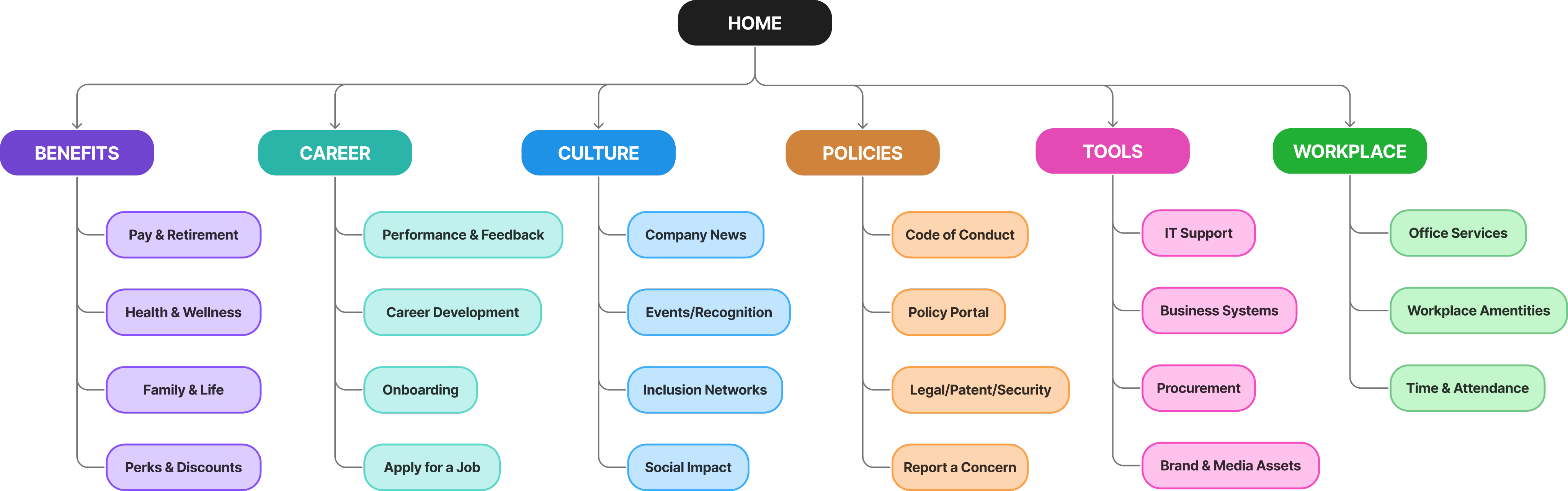
^ proposed; 6 smaller tier 1 items
Phase 3: Content Audit & Card Sort
I collaborated with content owners to map out every critical link within the new categories. This ensured that every "object" (like Benefits or Tools) contained the specific "tasks" users expected.
🧠 Bucketing items into intuitive categories allows for seamless discoverability of content
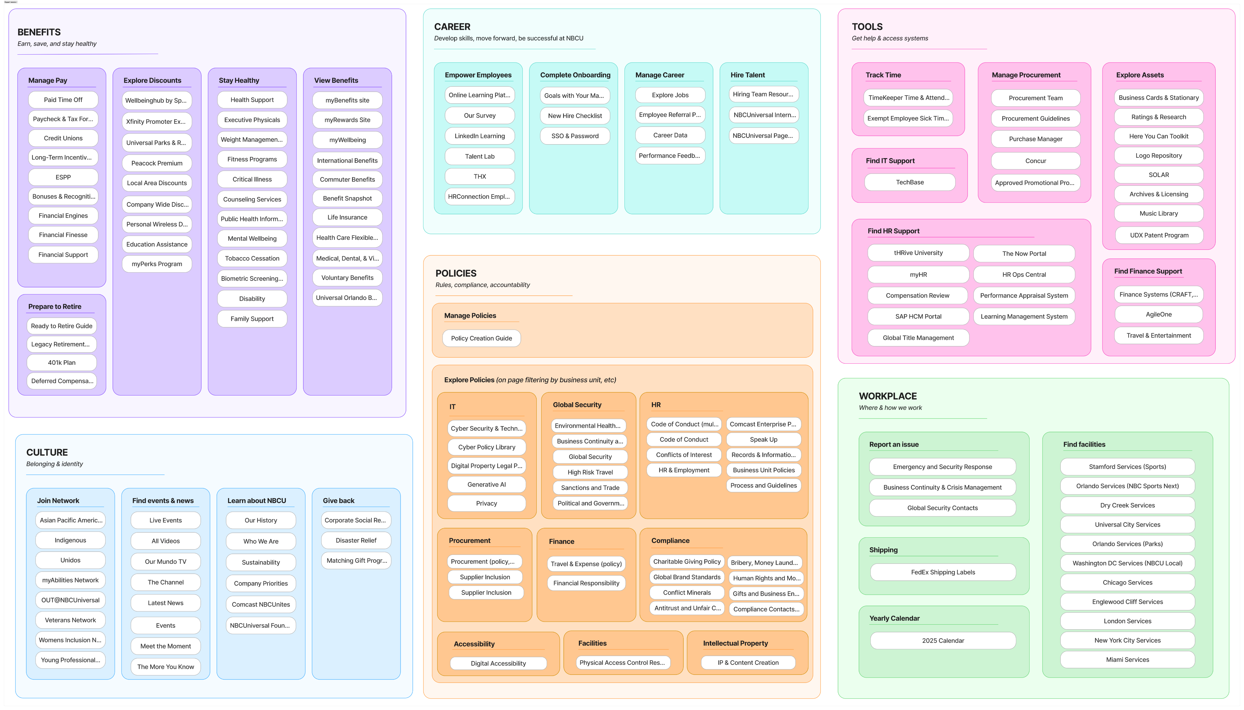
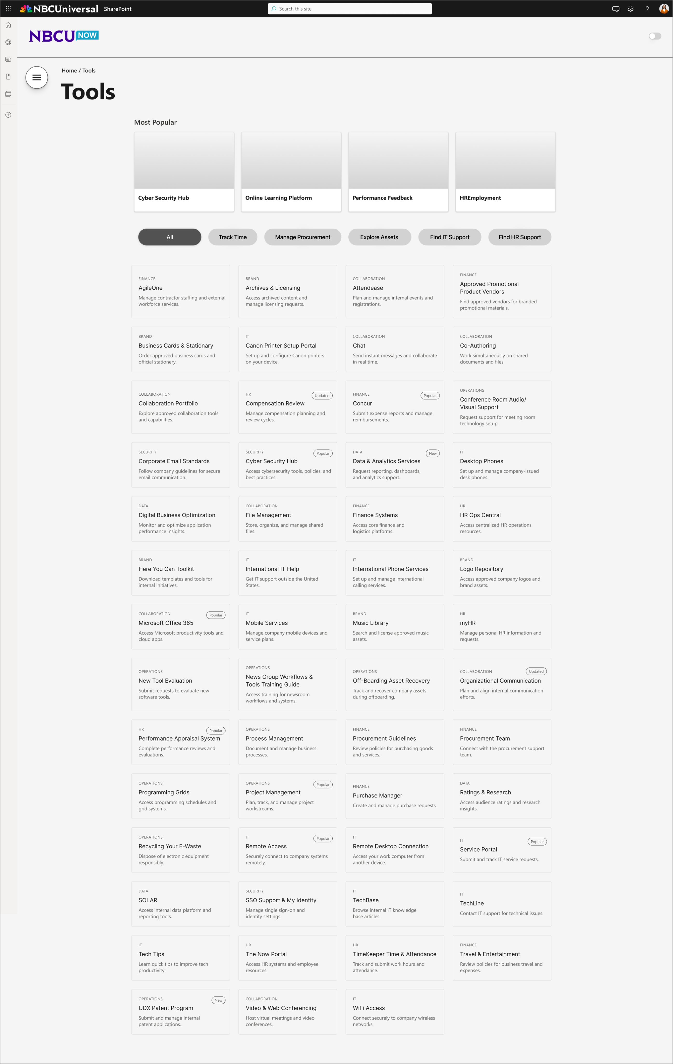
Phase 4: Hub Pages & Information Design
Finally, I collaborated with designers to establish a standard Information Design Framework for the category landing pages (Hubs) to maximize content scannability and context. This was based on competitive research and design best practices.
⭐️ Providing context for users allows for more efficient content discovery
^ hub page wireframe, including card examples
- Added metadata tags to explain ambiguous titles
- Integrated chips for seamless task-based filtering; reduces navigation path
- Surfaced "Most Popular" tools via engagement data
- Eyebrow headers provide instant category recognition; no more guessing where the card will take you
Design
👀 Take a Peek
By layering this validated taxonomy over the "Two Front Doors" UI, we created a navigation experience that was both functionally efficient and visually editorial.
🏆 Strategy and designs were approved for final development
🚀 Used the survey confusion data to justify the 2-tier shift
✅ Transformed a messy "mega menu" into a logic-backed navigational strategy
Reflection
A Look Back
✨ Navigation strategy served as the project backbone.
🔍 Proved logical structure must precede visual polish.
🧠 Displaced external vendor costs through internal research.
A Look Forward
📊 Gained confidence presenting research to leadership!
🚀 Project on track for a Q3 2026 rollout.
🌱 Discovered how data drives intentional design decisions.
Final Reflection Building a Culture of Research
While NBCUniversal has a deep design history, my mentor and I were the first dedicated UX researchers ever embedded directly into this specific team. My internship was a unique opportunity to not only deliver a high-stakes project but to prove to a veteran design group and senior leadership that research is the backbone of successful design.
Through the NBCUnow project, I learned that the purpose of research is to ensure the design patterns we propose are unassailable. By framing our choices through competitive benchmarking and user validation, we moved from subjective debates over "vibe" to a data-backed direction that leadership found impossible to argue with.
Establishing this precedent has far-reaching impact: it minimizes the risk of costly pivots and ensures that as the team continues to grow, we are building on a foundation of intentional, evidence-based success.