FetchIt: End-to-End Mobile UX Case Study
Designing Clarity for
Pet Owners
Scope
End-to-End Application Design
Tools


Problem
❗️ Finding trustworthy pet information is overwhelming
❗ Resources are fragmented across many platforms
❗ Accessibility and clarity are not prioritized
Solution
✅ Centralizes trusted pet care information
✅ Provides personalized help in multiple formats
✅ Reduces stress through accessible design
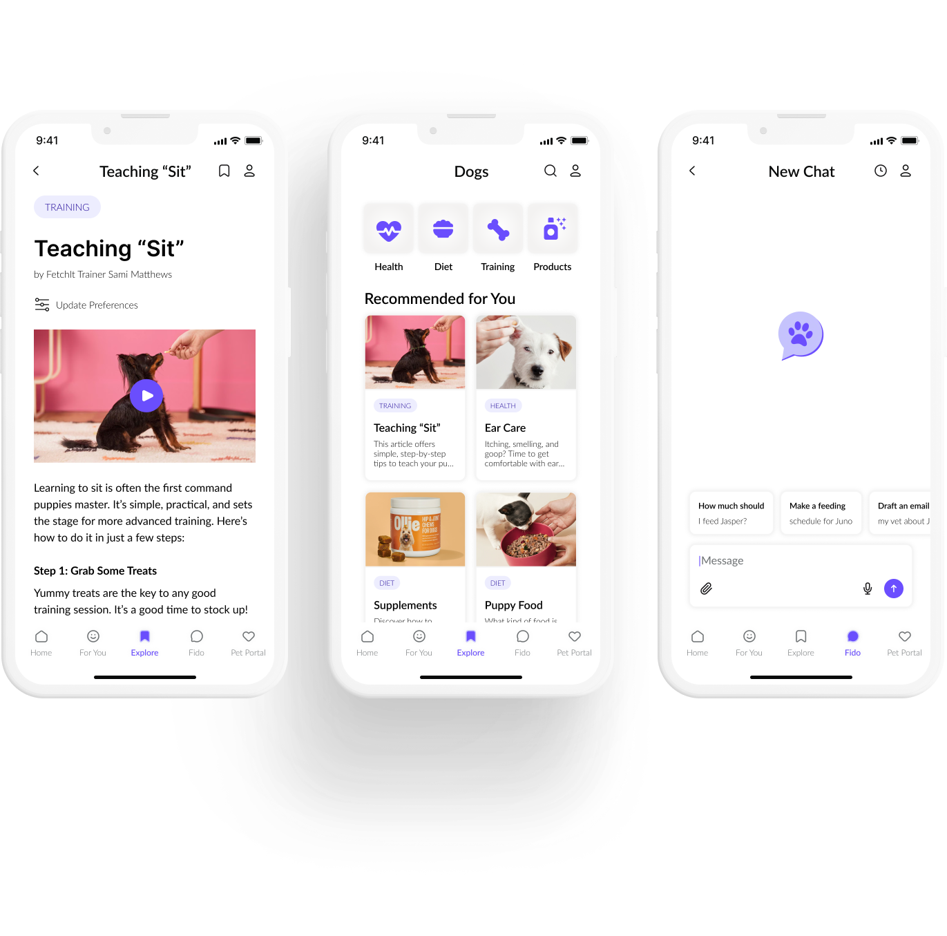
👀 Take a Peek
Research
Research Questions
- What formats help pet owners learn best?
- How can accessibility needs be better supported?
- When does AI add value over traditional resources?
- Where do current pet care resources fall short?
Preliminary Survey
🔎 Findings
- Users prefer short, visual, step-by-step content
- Strong interest in an AI assistant, with trust concerns
- New owners need quick access to critical information
✨ Design Implications
- Support multiple content formats and strong search
- Design a trustworthy, personalized AI assistant
- Surface critical information and vet pathways early
User Interviews
🔎 Findings
- Visual, concise information reduces overwhelm
- Trust and accuracy are essential for AI adoption
- Conflicting advice is a major source of stress
✨ Design Implications
- Prioritize clarity, visuals, and accessibility
- Build trust through transparency and validation
- Provide clear paths to professional resources
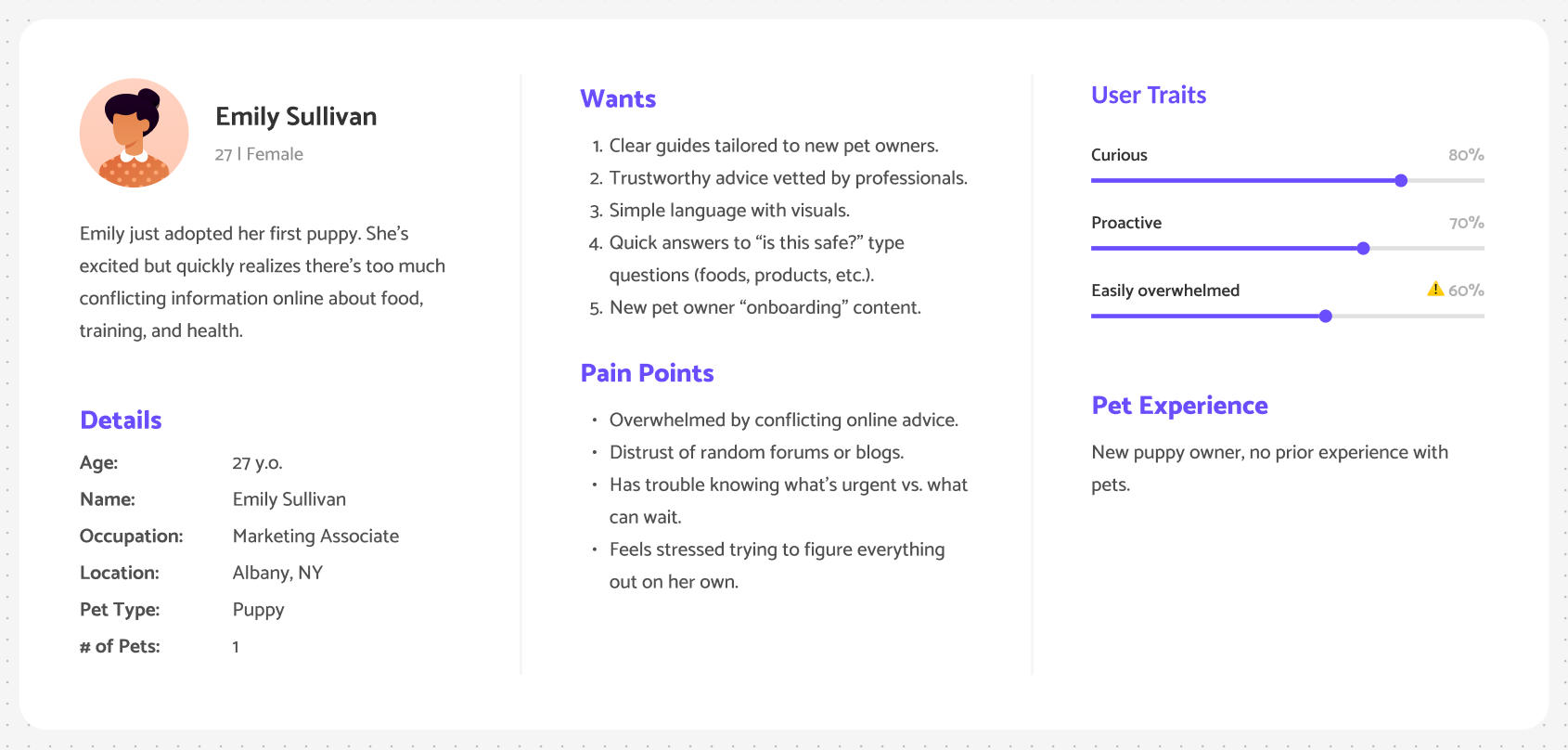
Personas
Next →
← Back
Design
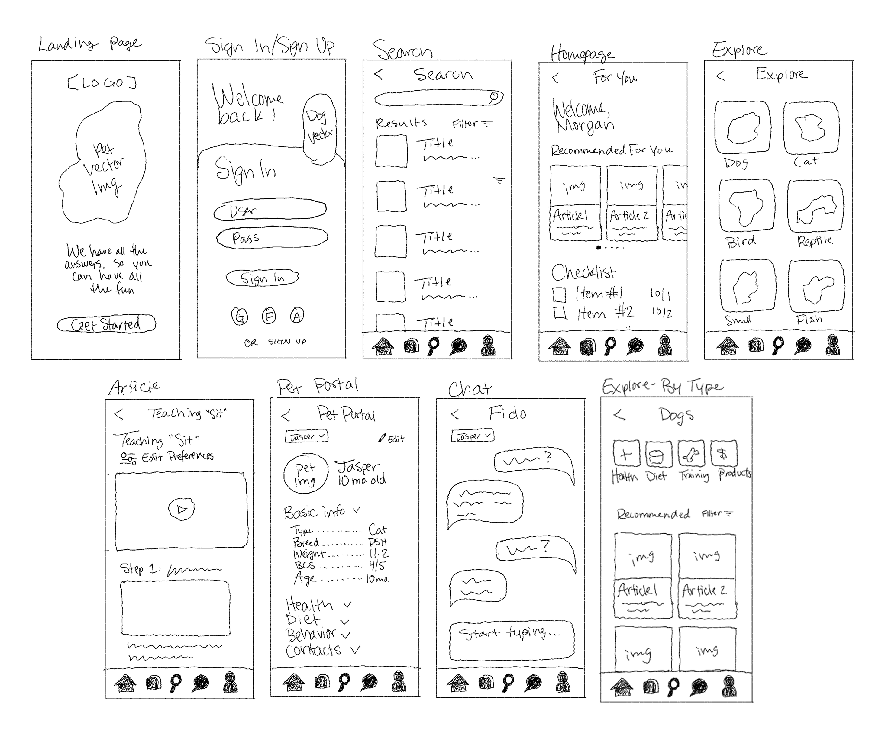
Lo-Fi Sketches
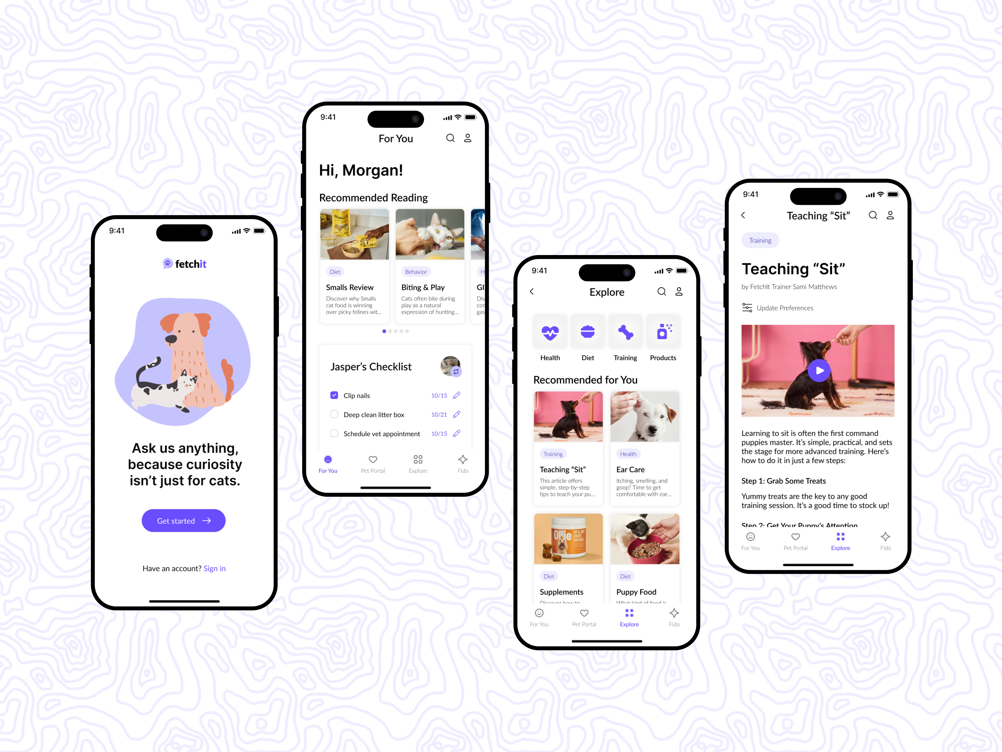
Final High-Fidelity Screens
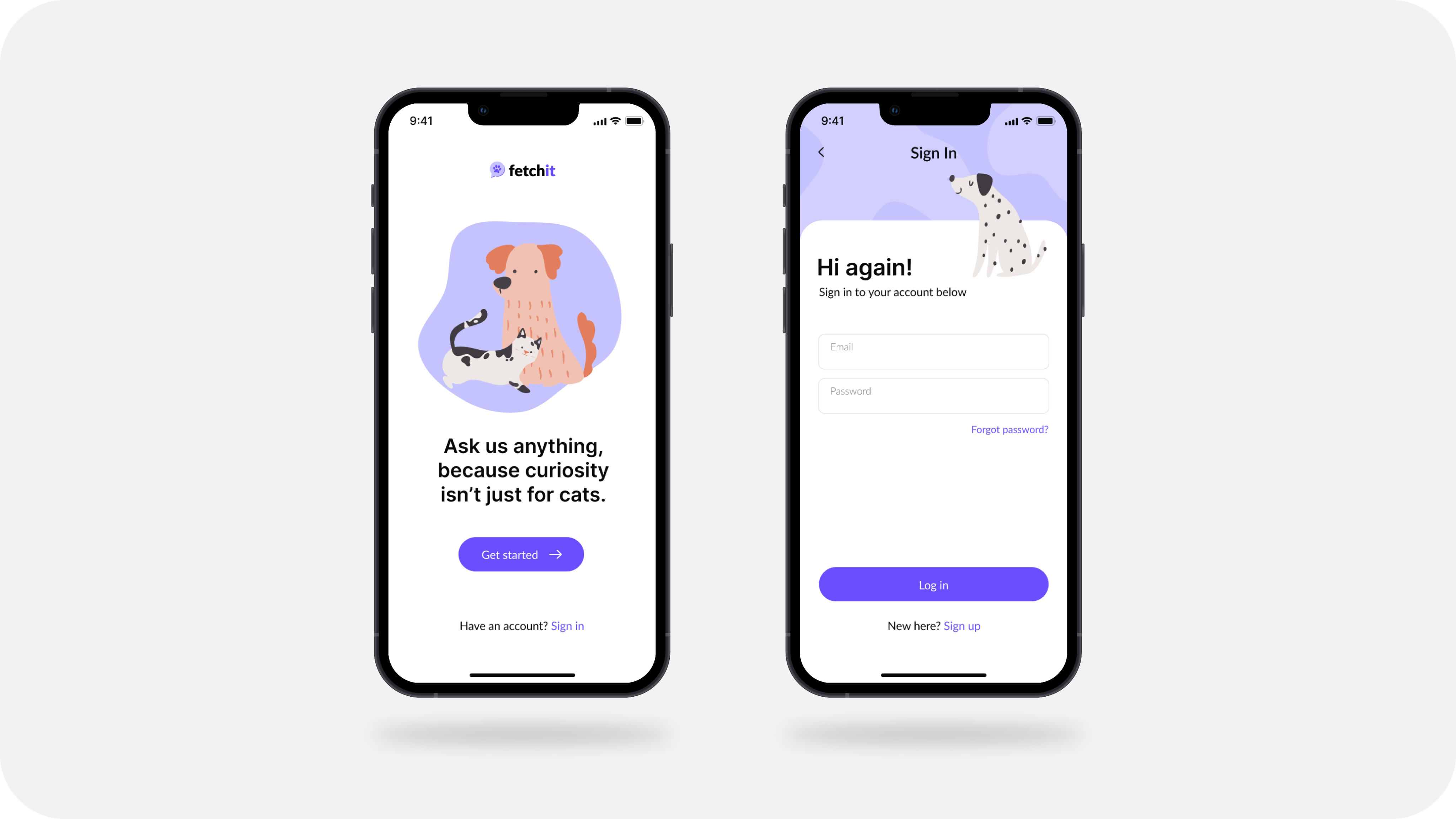
Splash Page & Sign In
A simple, welcoming onboarding flow introduces new users to FetchIt and makes getting started quick and accessible.
Next →
← Back
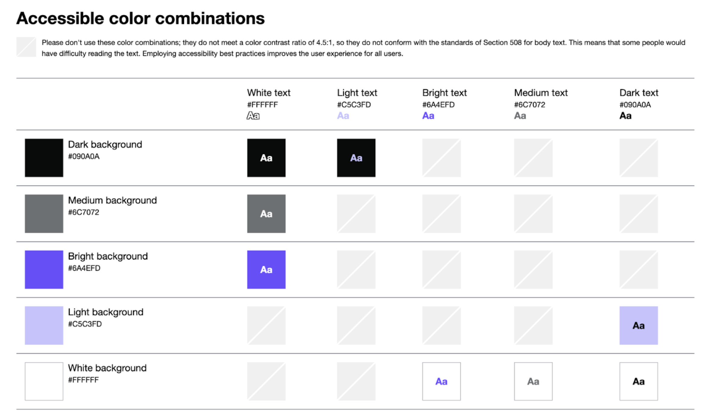
Accessibility Audit
🎨 Improved text contrast to meet WCAG AAA
🖼️ Added alt text for screen reader support
✅ Final scan in Stark resulted in 0 accessibility issues
User Testing
Final Prototype
Usability Testing
📖 Finding information via articles
- Users relied heavily on search to find content.
- “Explore” page initially confusing, but understanding improved with use.
🐾 Adding pets to pet portal
- Adding pets was straightforward.
- Purpose of the feature unclear at first; personalization explanation clarified it.
💬 Chatting with Fido (AI assistant)
- Users found the chat familiar and intuitive.
- No notable issues encountered.
Design Iteration
🔍 Improved findability of care checklist
- Care checklist initially overlooked → design tweaks boost visibility & usability.
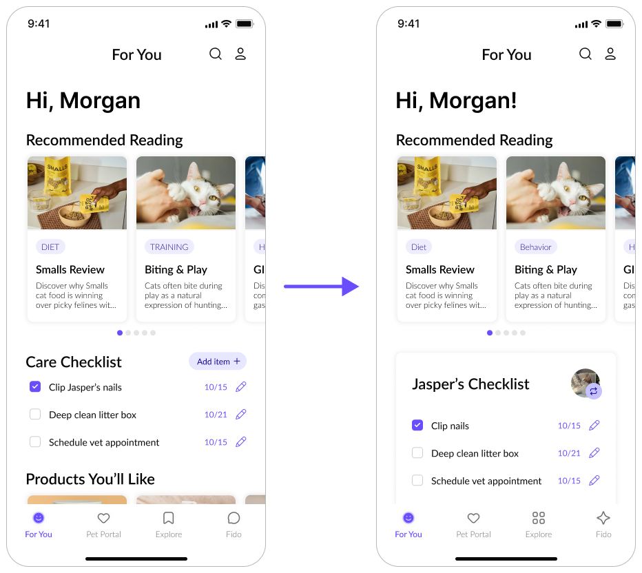
✨ Updated AI icon in navigation bar
- Previous icon unclear → new icon clearly signals AI feature.

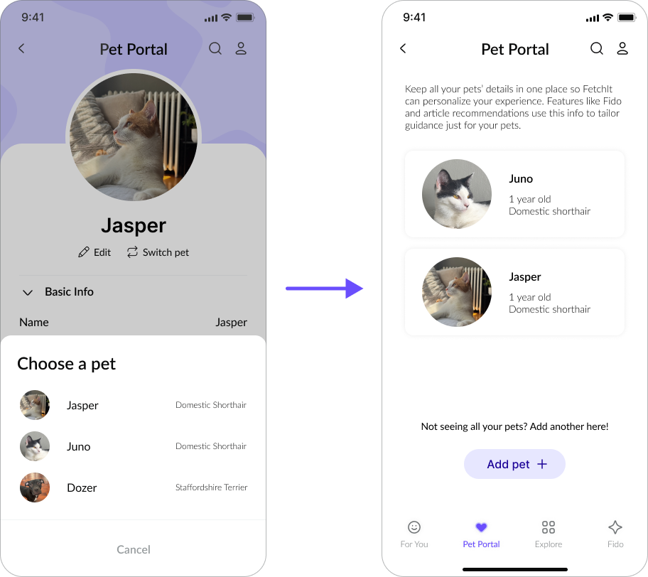
🐾 Introduced a “My Pets” page
- Switching pets felt unintuitive → intermediary page resolved it.
Reflection
A Look Back
✨ First end-to-end mobile design experience
🔍 Integrated research, accessibility, and iterative testing
🧠 Reduced complexity to increase clarity and confidence
❤️ Reinforced the value of designing for real user needs
A Look Forward
🧰 Stronger toolkit in research, accessibility, and iteration
📊 Deeper confidence synthesizing behavioral insights
📱 Improved end-to-end mobile product design skills
🌱 Commitment to accessible, intuitive design going forward
Full Case Study
Thanks for checking out my work!
If you’re interested in the full details, you can read my full final paper here.